Why I Built panelforest
Forest plots are a staple of clinical research, meta-analyses, and NMA. R has no shortage of options — forestplot, forestploter, forester, meta::forest() — but after using them across several projects, I kept running into the same frustrations:
- Most packages use a configuration-style API: one long function call with dozens of parameters, where adjusting layout means hunting through docs for the right argument name
- The panel combinations I actually want — text on the left, CI in the middle, a bar chart on the right — are rarely built-in, so I end up hand-assembling things
- Grouped rows, summary rows, stripes, dividers: every package handles these differently
- Changing the color or shape of specific rows usually requires hacking the underlying data
So I wrote panelforest.
The core idea is simple: a forest plot is just several panels placed side by side, each with its own rendering logic. Instead of designing it as a “forest plot function,” let users declare which columns they want and what each one should look like — then let the engine handle the rest.
Project: https://github.com/lenardar/panelforest
What It Looks Like
Here’s the result:
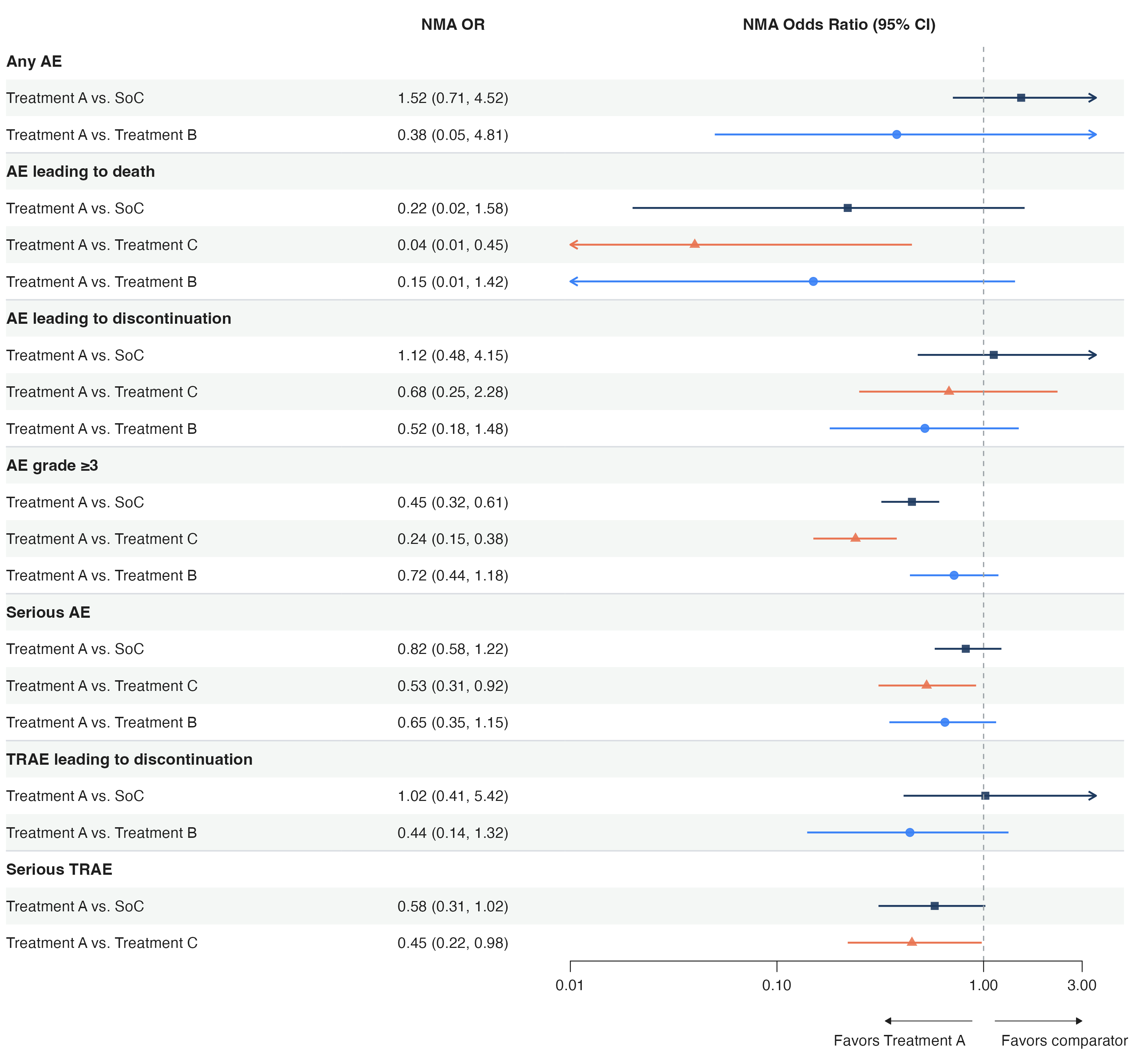
This is a forest plot from an NMA safety analysis. It includes:
- A text column on the left (subgroup labels)
- A text column in the middle (OR values)
- A CI panel on the right (log scale, reference line, truncation arrows, favors annotation)
- Bold group rows, row dividers, striped background
- Different colors and shapes per comparison
The code to produce this is about 30 lines, all pipeline composition.
How to Use It
Basic Structure
1 | library(panelforest) |
Each add_*() appends a panel column to the layout. Order determines left-to-right arrangement. To change the layout, move the calls around.
Panel Types
Currently built in:
add_text()/fp_text()— plain text column, supports alignment, indentation, format functionsadd_text_ci()/fp_text_ci()— formats est/lower/upper into “0.45 (0.32, 0.61)”add_ci()/fp_ci()— CI visualization: log scale, truncation arrows, diamond summaries, favors annotationadd_bar()/fp_bar()— horizontal bar chartadd_dot()/fp_dot()— dot + error baradd_gap()/fp_gap()— fixed-width gapadd_spacer()/fp_spacer()— absolute-unit spacer (mm)fp_custom()— custom panel: pass in a function that returns a ggplot
When the built-ins aren’t enough, fp_custom() combined with fp_register() lets you register a custom panel type that the engine will treat like a native one.
Column-Driven Aesthetic Mapping
Similar to ggplot2’s aes(), panelforest uses fp_aes() to map data columns to visual attributes:
1 | # df has columns ci_colour and ci_shape |
This lets each row have a different color and shape without setting them row by row.
A Unified edit() Layer
Need special treatment for specific rows? One edit() function handles row-level, cell-level, and row-height edits:
1 | forest_plot(df) |> |
The panel argument accepts an index, header string, or column name — no need to remember panel numbers.
Spanning Header Groups
Multiple panels can share a parent label with add_header_group(), and nesting levels are inferred automatically:
1 | forest_plot(df) |> |
Multi-level nesting is supported — a group that contains other groups is automatically promoted to a higher tier.
Design Decisions
Why ggplot2 + patchwork
Each panel is an independent ggplot object, assembled horizontally with patchwork. The benefits:
- Inherits ggplot2’s rendering quality and theme system
- Independent coordinate systems per panel — CI panels can use log scale while text panels use [0, 1], without interference
- patchwork’s layout system natively supports mixing proportional and fixed widths
- The output is a standard ggplot object, so
ggsave()just works
The downside is performance — rendering slows when there are many panels or many rows. But forest plots are typically tens to a few hundred rows; at that scale it’s not an issue.
Why Not a ggplot2 Geom
The alternative would be a geom_forest() extension. I didn’t go that route because a forest plot is fundamentally “multiple heterogeneous column panels” — each column has completely different coordinate systems and rendering logic. Forcing that into ggplot2’s facet or annotation systems would be awkward.
patchwork’s multi-panel approach is more natural: each column is an independent ggplot that doesn’t interfere with the others, but they share a common row coordinate.
fp_size(): Let Content Determine Dimensions
Forest plot dimensions should be determined by content, not guessed by the user. fp_size() calculates exact inch dimensions from the number of panels, row count, and row heights:
1 | size <- fp_size(plot_obj) |
No matter how many panel columns you add or how many rows your data has, the output will always have consistent density and proportions.
CI Panel Details
fp_ci() is the most feature-dense panel:
- Log scale:
trans = "log", automatically handles positive-value constraints and axis labels - Truncation arrows: when CIs extend beyond the display range, arrows indicate the truncation direction;
arrow_type = "open"or"closed" - Diamond summaries: rows marked with
add_summary()render as diamonds automatically - Favors annotation:
favors_left/favors_rightdraw directional arrows and labels below the axis - Reference line:
ref_linedraws a dashed vertical line - Aesthetic mapping: per-row colors, shapes, and sizes via
fp_aes()
Any of these alone is straightforward. Combined, they cover the vast majority of clinical forest plot requirements.
A Complete Example
1 | library(panelforest) |
The structure is clear: data → decorations → panels → render. To change layout, reorder the add_*() calls. To change style, add edit().
Roadmap
panelforest is currently at v0.2.0, with core features stable. Planned work:
forest_plot_from()— model-to-forest-plot: pass inglm,coxph,lm, etc., and get a forest plot automatically. Powered bybroom::tidy(), with automatic effect size and scale inference per model type. Planned support forlme4,metafor,brms.add_rule()— conditional styling: declarative rules for batch highlighting, as an alternative to repeatededit()calls- More scales:
sqrt,logit, etc. - Text wrapping, export helpers, footnote system, and other UX improvements
The model-direct direction is the most important — making panelforest not just a plotting tool, but something that connects directly to statistical model output, removing the “run the model, manually wrangle the data, then plot” cycle.