Why I Built PyKMExtract
My previous post about PyHEOR described a workflow I find genuinely useful: published KM figure → IPD reconstruction → parametric fitting → economic modeling. But the first step — extracting coordinates from KM figures — is still manual labor. WebPlotDigitizer requires clicking point by point. Engauge Digitizer is semi-automated at best. A two-arm KM figure can easily take 15-20 minutes.
When a systematic review involves a dozen papers with two or three KM figures each, manual digitization becomes a serious time sink.
So I built PyKMExtract — a KM curve digitization tool built for research workflows. It extracts structured time / survival data from paper screenshots, validates the output, and bridges directly to PyHEOR for Guyot reconstruction and survival modeling.
Project: https://github.com/lenardar/PyKMExtract
Core Design: Simple Default Pipeline + Optional AI Enhancement
The guiding principle:
The default extraction pipeline stays interpretable and auditable. AI can participate, but only as an explicit enhancement layer — not as the sole measurement source.
Why not just have GPT-4o look at the image and output coordinates? Because LLMs are good at understanding what a figure shows, but not at measuring which pixel is at which row and column. Mixing semantic understanding with precise measurement in one black box makes failures hard to trace.
PyKMExtract separates the two:
1 | Semantic extraction → Axis detection → Color extraction → KM step sampling → Coordinate mapping → Validation |
AI handles semantics. Pixel measurement is handled by deterministic algorithms. Each layer is independently verifiable.
Extraction Pipeline
Step 1: Semantic Extraction
“Semantics” means the structured information in the figure: how many curves, what are they called and what color are they, what are the axis ranges, is there a number-at-risk table.
Two sources are supported:
- Manual
semantic.json: for high-precision use cases, where axis ranges and colors are human-confirmed - Online vision model: any OpenAI-compatible API (GPT-4o, Qwen-VL, etc.) for automatic recognition
Vision model calls are guided by a structured prompt that requires strict JSON schema output, with automatic retry and normalization. The model’s rgb_approx is treated as approximate — the color extraction step below uses adaptive tolerance to refine it.
Step 2: Axis Detection
Automatically detects the axis line positions in the figure, establishing pixel boundaries for the plot area.
The algorithm is direct: scan the grayscale image row by row and column by column, find the longest continuous dark pixel segment in each direction, and locate the origin at the intersection of the horizontal and vertical lines. If axis detection is ambiguous (e.g., no clear border lines), it falls back to the bounding box of non-white pixels.
This step also supports optional AI axis refinement: the vision model annotates candidate anchor points on the image and selects or adjusts them, yielding a more precise four-point mapping. This helps when the axes aren’t perfectly orthogonal or the image has cropping offsets.
Step 3: Color Extraction
Given the approximate RGB color of each curve, matching pixels in the plot area are found using Euclidean distance:
1 | distance = sqrt((R - R_target)² + (G - G_target)² + (B - B_target)²) |
The tolerance isn’t fixed — adaptive tolerance scanning starts tight (tolerance=8) and progressively loosens (8→12→18→24→32→…) until both pixel count and x-direction coverage are satisfied. This avoids missing pixels from a too-tight threshold and mixing in background noise from a too-loose one.
If the figure has confidence interval bands, they’re removed automatically using column-density statistics — CI bands have much higher pixel density per column than the curve itself.
Step 4: KM Step Sampling
This is the key difference between PyKMExtract and general-purpose curve digitizers.
KM curves are right-continuous step functions — horizontal segments mean no events occurred, vertical drops mean events happened. Generic curve sampling using column medians or means smooths out the vertical drops and loses the step structure.
PyKMExtract instead takes the lower envelope per column (maximum y pixel value, i.e., the lowest point), then resamples onto a regular x grid using right-continuous forward fill. Horizontal segments stay horizontal; vertical drops stay instantaneous jumps, without artificial slopes.
1 | Raw pixel cloud → Per-column lower envelope → Regular x-grid resampling → Step curve |
Step 5: Coordinate Mapping and Cleaning
Pixel coordinates are linearly mapped to data space (time, survival) using four-point anchor mapping. If the y-axis is a percentage (0–100), it’s automatically normalized to 0–1.
Cleaning steps:
- Sort by time and deduplicate
- Suppress isolated downward spikes (brief drops that immediately recover — noise)
- Collapse short descending segments (false slopes from thick line edges)
- Enforce cumulative minimum (guarantee monotone non-increasing)
- If the first time point is not 0, automatically prepend
(0, 1.0)
Step 6: Validation
After extraction, a set of checks runs before output:
| Check | Weight | Description |
|---|---|---|
| Monotonicity | 30 | Survival probability must be monotone non-increasing |
| Range | 20 | All values must be in [0, 1] |
| Origin | 15 | First point should be close to 1.0 |
| Coverage | 15 | Curve should span at least 75% of the x-axis |
| At-risk consistency | 20 | Extracted survival probabilities should not deviate too far from what the number-at-risk table implies |
These produce a weighted score from 0–100. An additional overlap ambiguity check runs separately — if two curves have a long stretch of overlapping pixels, the score is capped at medium to flag the result for manual review.
Validation isn’t about hiding problems. Difficult figures should be retained as low-confidence results, not forced into high scores.
Usage
Single Figure (with Semantic JSON)
1 | pykmextract figure.png \ |
Single Figure (Vision Model)
1 | export OPENROUTER_API_KEY="..." |
With AI Axis Refinement
Add --axis-refine to run a second vision model call for four-point axis correction:
1 | pykmextract figure.png \ |
Python API
1 | import pykmextract as pkm |
Batch Processing
For a batch of literature KM figures, name images as study01_os.png / study01_pfs.png and then:
1 | # generate manifest |
Output is organized by study and endpoint: runs/study01/os/, runs/study01/pfs/, …
Output
Each extraction task produces a review bundle for human auditing:
original.png— copy of the input imageoverlay.png— extracted curve overlaid on the original for visual comparisondigitized_curves.csv— extracted numerical coordinatesreview.md— structured review reportreconstructed_km.png— KM curve redrawn from reconstructed IPD (when PyHEOR is available)ipd_*.csv— reconstructed individual patient data
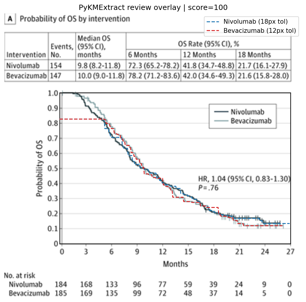
The overlay is the most direct validation — you can immediately see how well the extracted dashed curve aligns with the original solid curve.
Real Literature Testing
I tested on 10 panels from 5 phase III trials published in JAMA Oncology and The Lancet (OS and PFS endpoints).
All 10 panel overlays:
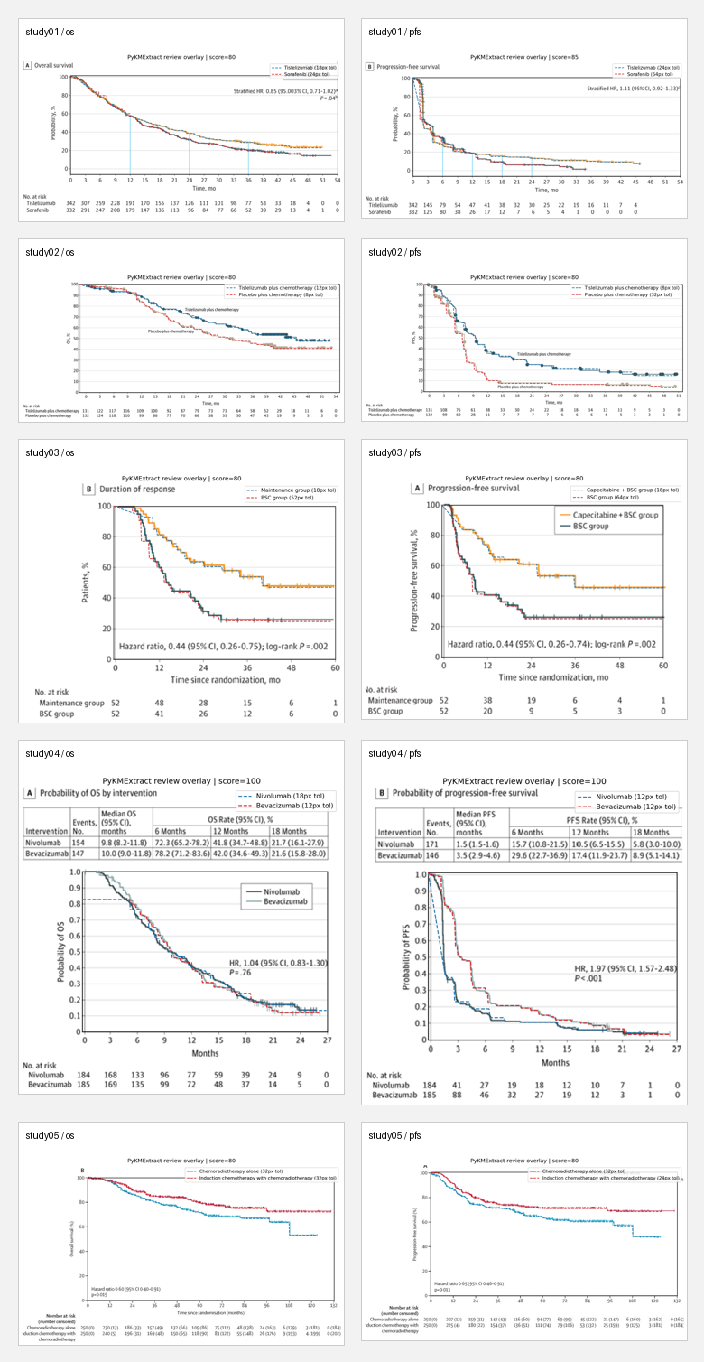
Manual review results:
| Panel | Score | Assessment | Main issues |
|---|---|---|---|
| study01 / os | 80 / high | Good | Tail deviates from at-risk |
| study01 / pfs | 85 / high | Usable | Coverage drops in latter half |
| study02 / os | 80 / high | Usable | Both curves deviate from at-risk |
| study02 / pfs | 80 / high | Weak | Mid-to-late section runs low |
| study03 / os | 80 / high | Weak | Thick steps, weak at-risk consistency |
| study03 / pfs | 80 / high | Weak | Latter portion looks smoothed |
| study04 / os | 100 / high | Best | Closest to original |
| study04 / pfs | 100 / medium | Good | Long overlap between curves, score capped |
| study05 / os | 80 / high | Good | Main deduction from at-risk |
| study05 / pfs | 80 / high | Good | Same as above |
Best result (study04 / os, CheckMate 143):
Original vs. KM redrawn from reconstructed IPD:
| Original | Reconstructed KM |
|---|---|
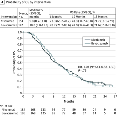 |
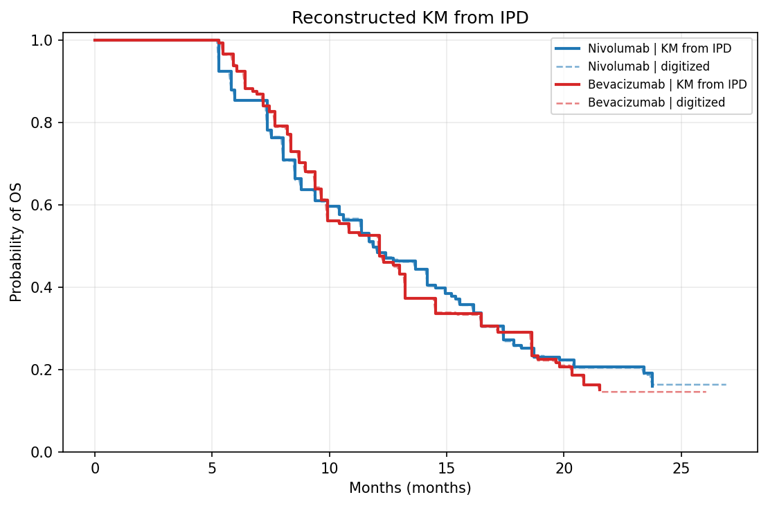 |
Extraction overlay:
The honest takeaway:
- For standard KM figures with white background, high contrast, and 1–2 curves, PyKMExtract is ready for “automated extraction + quick human review” workflows
- Currently weaker on: grayscale figures, curves with similar colors, dense CI bands, low-resolution scans
- Scores aren’t the goal — overlays are. An 80-point figure might look great visually; a 100-point figure might be capped at
mediumdue to overlap ambiguity
Integration with PyHEOR
PyKMExtract output feeds directly into PyHEOR for Guyot reconstruction:
1 | import pykmextract as pkm |
This completes the full pipeline: paper KM screenshot → automated extraction → IPD reconstruction → parametric fitting → economic modeling, with the manual digitization step automated away.
Known Limitations
This is a practical MVP, not a universal digitizer that works on every KM figure. Explicitly weaker scenarios:
- Grayscale figures or curves with similar colors (color extraction relies on RGB distance)
- Multiple densely overlapping curves (overlapping segments can’t be separated by color alone)
- Heavy CI bands and dense censoring markers (CI removal is heuristic)
- Low-resolution scans or heavily compressed screenshots
- Fully automated PDF parsing
These are intentional tradeoffs — better to honestly report a low score and flag it for manual review than to disguise a bad extraction as a confident result.
Roadmap
- Better edge case handling (grayscale, low contrast)
- Smarter overlapping curve separation
- Support for more vision model backends
- Direct PDF input (automatically identify KM figure pages)
- Deeper PyHEOR integration (end-to-end pipeline)
If you’re doing systematic reviews or health economics modeling and need to extract KM data from literature: PyKMExtract on GitHub